We currently use Storybook to document the components on the website and provide a pseudo-CMS experience for our editors.
You can visit the up-to-date storybook here
Running locally
After cloning the posthog.com repository and installing the dependencies, running Storybook locally is simple as running the command:
Once yarn storybook is run, a new Storybook window will open.
Using Storybook to create landing pages
To conceptualize what your landing page will look like, first run through the available components in the sidebar located to the left of Storybook. These are all of the components available to you!
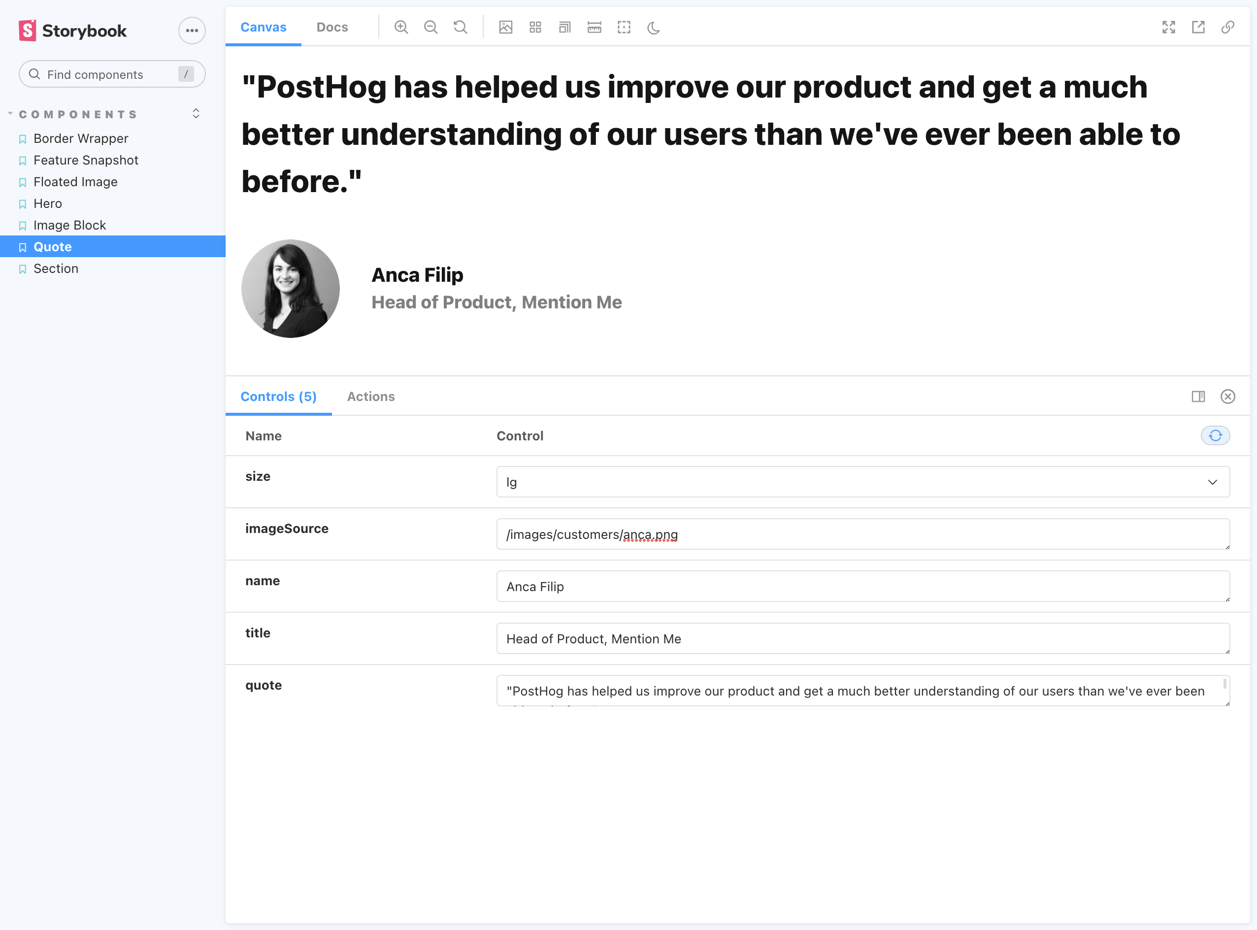
In this example, we're going to start the landing page by adding a quote from one of our customers:

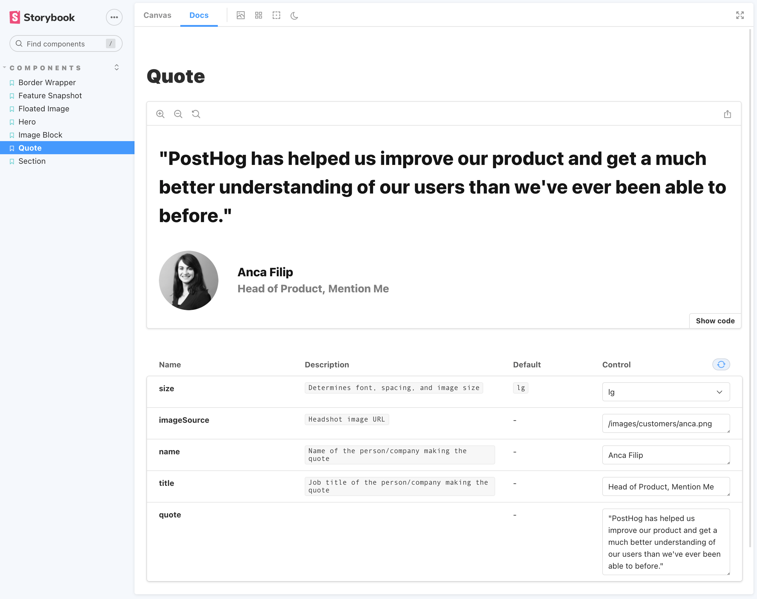
You'll notice some default values are already added. Let's move to the Docs tab to get a better description of each value. Then we can adjust them accordingly.

In the image above, you'll see that all of the props for this component are editable under the Control section. Editing these values automatically updates the preview of the component shown above the controls.
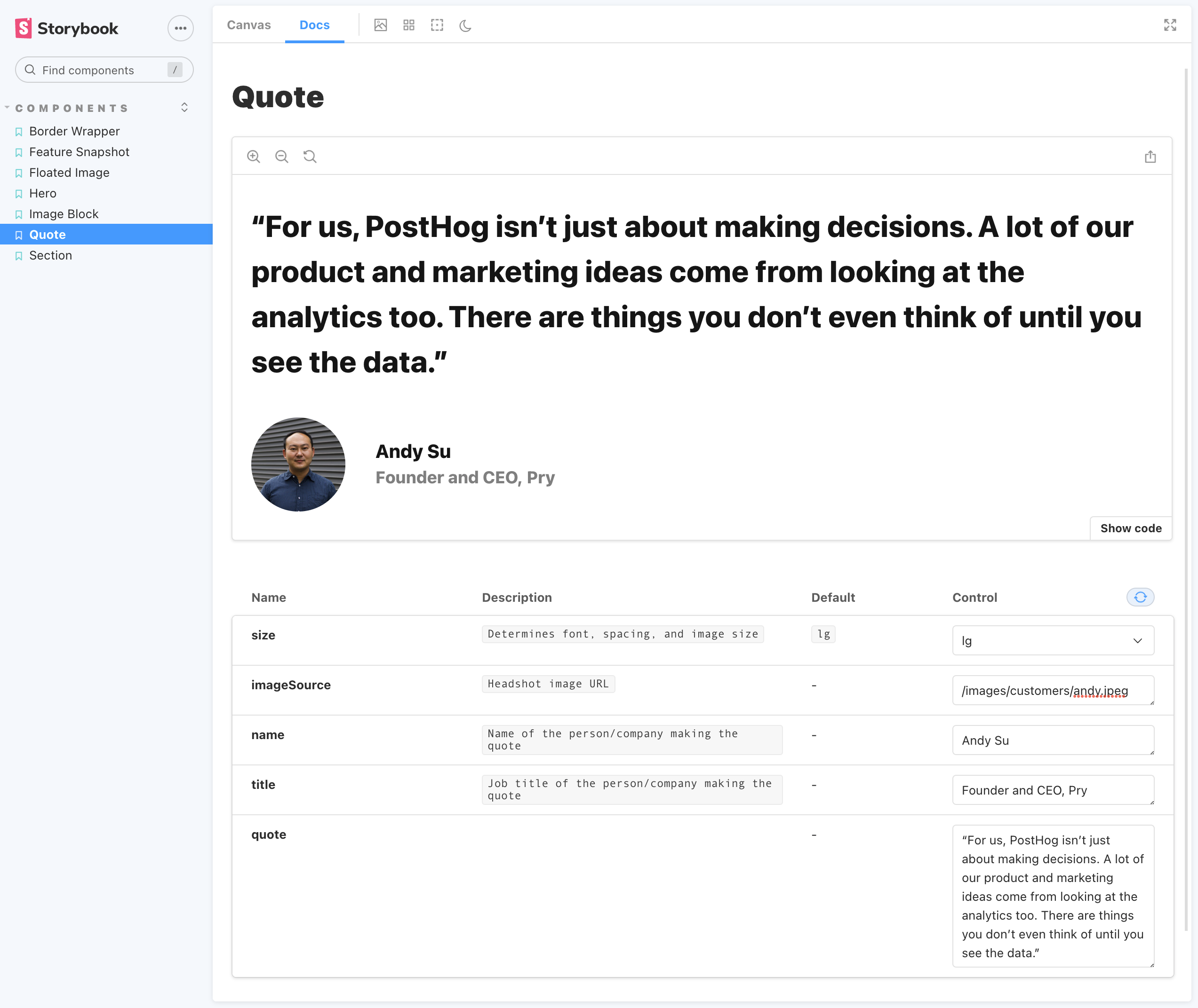
I like the size of the quote, so I'll leave that as is. Let's update the rest:

You'll notice the image has a relative path of /images/customers/andy.jpeg. Storybook is set up to automatically look for images in the /static folder at the project's root. So, any images that need to appear in your components should be added there and referenced accordingly.
Now that we have a pretty solid quote let's click the Show code button to get a copyable code snippet that we can paste into our MDX file!
“For us, PostHog isn’t just about making decisions. A lot of our product and marketing ideas come from looking at the analytics too. There are things you don’t even think of until you see the data.”
Cool! Now we know how to use Storybook to quickly create and copy components that we can use to scaffold eye-catching landing pages. Here's an example of what a landing page looks like using more of the components documented in Storybook.